As more users access the internet across a variety of devices, it’s crucial for advertisers to ensure that their banner ads are responsive. Responsive banner ads automatically adjust their size, format, and layout to fit different screen sizes, providing a seamless user experience on desktops, tablets, and mobile devices. This blog post outlines the best practices for designing responsive banner ads that perform effectively across all devices.
1. Understand the Importance of Responsiveness
1.1 Cross-Device Accessibility
Responsive banner ads are designed to adapt to different screen sizes and resolutions, ensuring that your ads look great and function well regardless of the device used. This accessibility is essential as users may interact with your ads on a desktop computer, tablet, or smartphone.
1.2 Improved User Experience
A responsive ad provides a better user experience by maintaining its visual appeal and readability across various devices. A well-designed responsive ad reduces the chances of distorted images, unreadable text, or misplaced CTAs, leading to higher engagement rates.

Best Practices for Responsive Banner Ads
2. Design with Flexibility in Mind
2.1 Use Scalable Vector Graphics (SVGs)
SVGs are ideal for responsive designs because they scale without losing quality. Unlike raster images (like JPEGs or PNGs), SVGs ensure that your graphics remain sharp and clear on any screen size.
2.2 Create Flexible Layouts
Design your banner ads with flexible layouts that can adjust to different aspect ratios and sizes. Avoid fixed-width elements and use relative units (like percentages) instead of absolute units (like pixels) to allow for better scaling.
2.3 Prioritize Key Elements
Identify the most important elements of your banner ad, such as the headline, CTA, and branding. Ensure these elements remain prominent and legible across all devices by adjusting their size, position, and alignment as needed.
3. Optimize Images and Text for Different Devices
3.1 Compress Images for Faster Loading
Large image files can slow down loading times, particularly on mobile devices with slower connections. Compress your images to reduce file size without sacrificing quality, ensuring that your ads load quickly and efficiently.
3.2 Use Readable Fonts and Sizes
Select fonts that are legible at smaller sizes, especially for mobile devices. Ensure that text remains clear and readable on all screen sizes by adjusting font size, line spacing, and padding. Avoid overly intricate or decorative fonts that may become difficult to read when scaled down.
3.3 Test for Readability
Regularly test your banner ads on different devices to ensure that text remains readable. Pay attention to how fonts, colors, and spacing appear on smaller screens and make adjustments as needed to maintain clarity.
4. Adapt CTAs for Different Screen Sizes
4.1 Ensure CTA Visibility
Your call-to-action (CTA) is one of the most crucial elements of your banner ad. Make sure the CTA button is easily visible and clickable on all devices. Use contrasting colors and ample spacing around the CTA to draw attention to it.
4.2 Size CTAs Appropriately
On mobile devices, users interact with ads using their fingers, so CTAs should be large enough to be easily tapped. Ensure that the CTA button is appropriately sized and spaced to avoid accidental clicks or user frustration.
4.3 Test Interactive Elements
If your ad includes interactive elements, such as buttons or dropdowns, test them on different devices to ensure they function correctly. Interactive elements should be responsive and provide a smooth user experience, regardless of the device used.
5. Leverage Responsive Ad Formats
5.1 Use Responsive Display Ad Formats
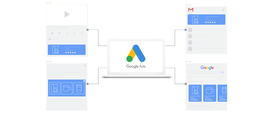
Platforms like Google Ads offer responsive display ad formats that automatically adjust to fit different placements and screen sizes. These formats simplify the process of creating ads that look good across a variety of devices.
5.2 Optimize for Ad Networks
Different ad networks may have specific requirements for responsive ads. Ensure your designs comply with these requirements to avoid issues with ad placement or performance.
6. Monitor and Adjust Performance
6.1 Track Device-Specific Metrics
Analyze the performance of your banner ads across different devices using analytics tools. Monitor metrics such as click-through rates (CTR), conversion rates, and bounce rates for desktop, tablet, and mobile users.
6.2 Make Data-Driven Adjustments
Use the data gathered from performance tracking to make informed adjustments to your ads. If a particular device is underperforming, tweak your design, layout, or content to better suit that platform.
7. Case Studies and Examples
7.1 Case Study: E-Commerce Banner Ad
An e-commerce company created responsive banner ads that featured scalable product images, legible text, and a clear CTA. By optimizing the ads for both desktop and mobile devices, they saw a 20% increase in overall CTR and a 15% boost in mobile conversions.
7.2 Case Study: Travel Industry Campaign
A travel agency designed responsive banner ads with flexible layouts and optimized images. The ads maintained visual appeal and functionality across all devices, leading to a significant increase in user engagement and travel bookings.
Conclusion
Designing responsive banner ads is essential in today’s multi-device world. By focusing on flexibility, optimizing images and text, adapting CTAs, and leveraging responsive ad formats, you can create banner ads that perform effectively across all devices. Implement these best practices to enhance your banner ad performance and ensure a seamless user experience for your audience, no matter where they interact with your ads.
